DI-RECT in De Kuip
It’s probably safe to say that everyone loves music. Or at the very least, everyone has that one piece of music that moves them. Music is a powerful, universal language we’ve collectively discovered. One that connects us, no matter our background. But how do you bring people together before a single note is even played? That’s exactly the question 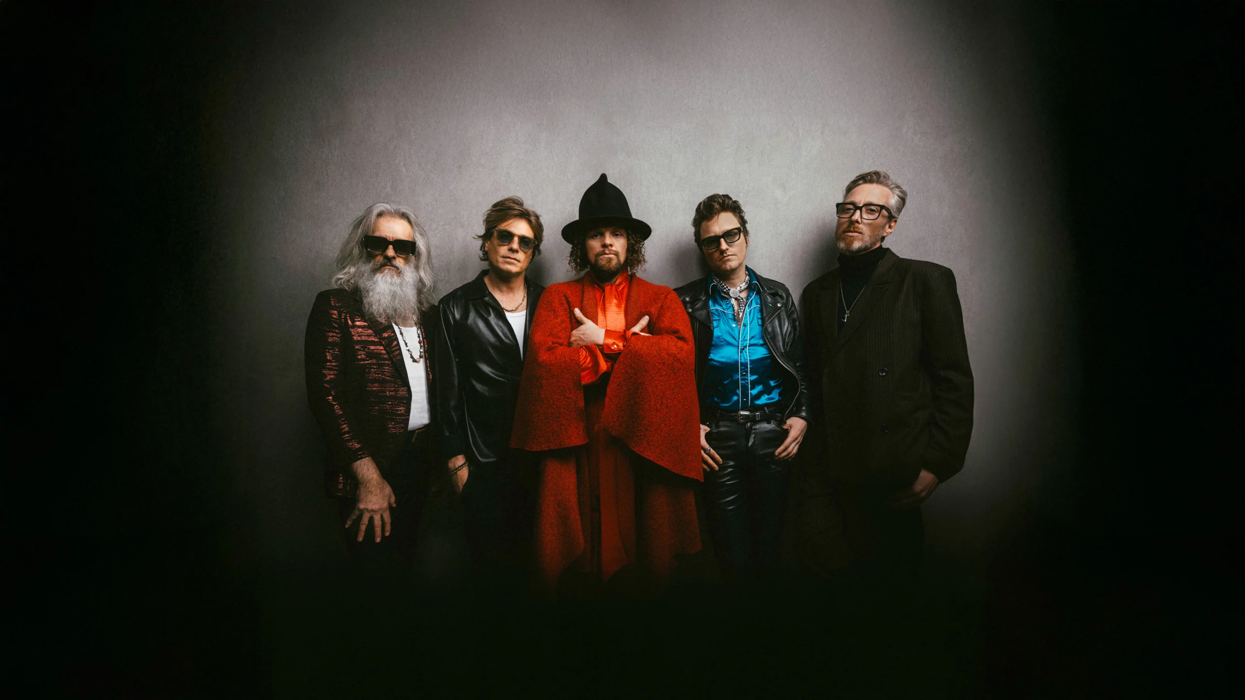 © Set Vexy
De Kuip
For 25 years, the music of Dutch rock band DI-RECT has been cranking up the stereo across the country. To celebrate this milestone, the band will perform three times in June 2025 at De Kuip in Rotterdam. While the stadium is best known as the home of Feyenoord, it’s also sacred ground in the world of music: legends like The Rolling Stones, Prince, U2, and Bruce Springsteen have all played there. DI-RECT will literally close the chapter. Theirs will be the final concerts ever held at De Kuip.
But a stadium doesn’t fill itself. That’s why DI-RECT reached out to us. And let’s stay humble: wherever the band goes, their loyal fans follow. Still, it was our job to bring the concerts into the spotlight visually.
Together with the band and Boemklap Industries, we developed a strategic plan. We mapped out both online and offline deliverables, along with their timing. The goal: ensure every touchpoint aligns, contributing to clear, unified communication. Next up: design.
Art DI-RECTion
Our aim was to create a strong central image that could be used across all promotional materials. That way, fans would repeatedly encounter the same recognizable artwork, reminding them of a show they simply can’t miss. This artwork became the core of the visual campaign around the concerts.
We had previously created the visual identity for DI-RECT’s Sphinx Club Tour, where we drew inspiration from 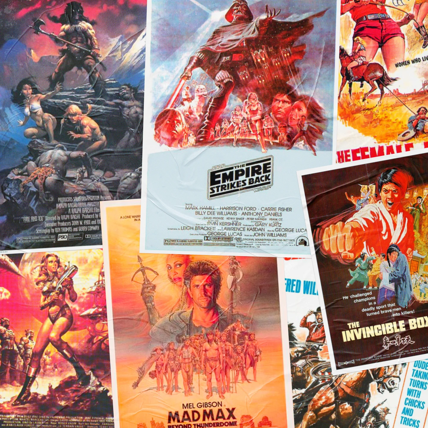
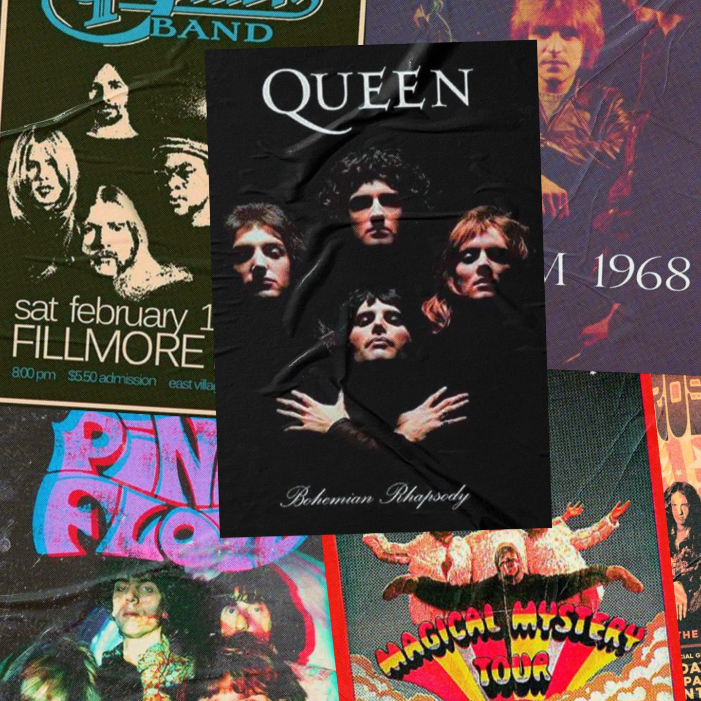
But for De Kuip, we took a lighter, more open approach. While staying true to the retro poster theme. These old posters often depicted their main characters in a collage-like style, elevating them to almost mythical status. That epic tone is exactly what we wanted to convey.
From dozens of band photos, we created one 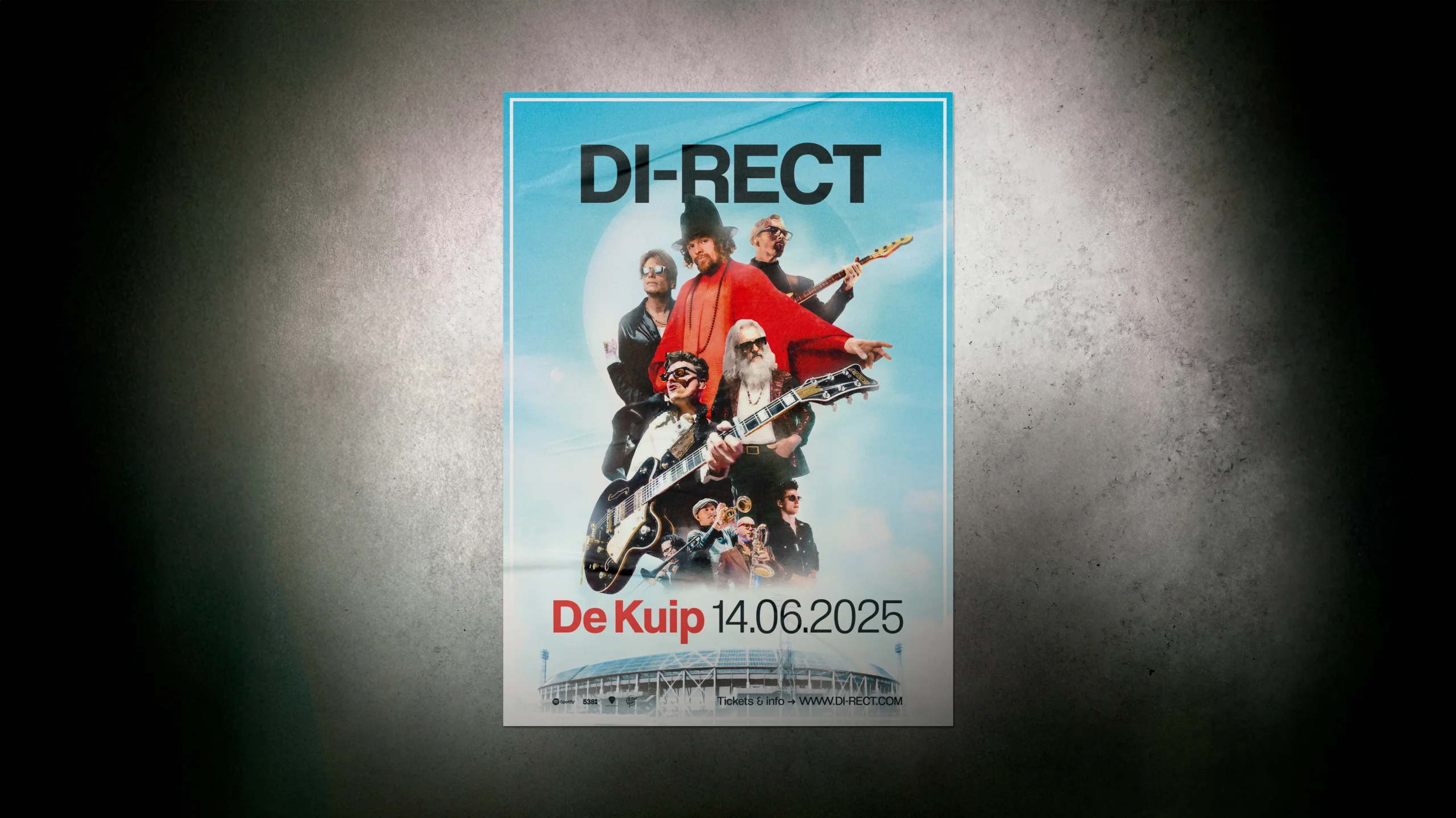
And that grand tone fits a show of this scale. Especially in a stadium where music legends have gone before. But the light irony in the image also makes it relatable and personal. Anyone who’s seen DI-RECT live knows the band delivers musical fireworks, but also warmth, humor, and chemistry. That unique blend of spectacle and humanity is reflected in the artwork.
Deliverables
The carefully crafted artwork served as a visual anchor for all campaign assets: from street posters to Instagram stories, ensuring no one could miss the show. Naturally, we created real rock posters too. You could spot them on the street, or buy one in a
For months, we were everywhere on Instagram, X (formerly Twitter), and Facebook. The 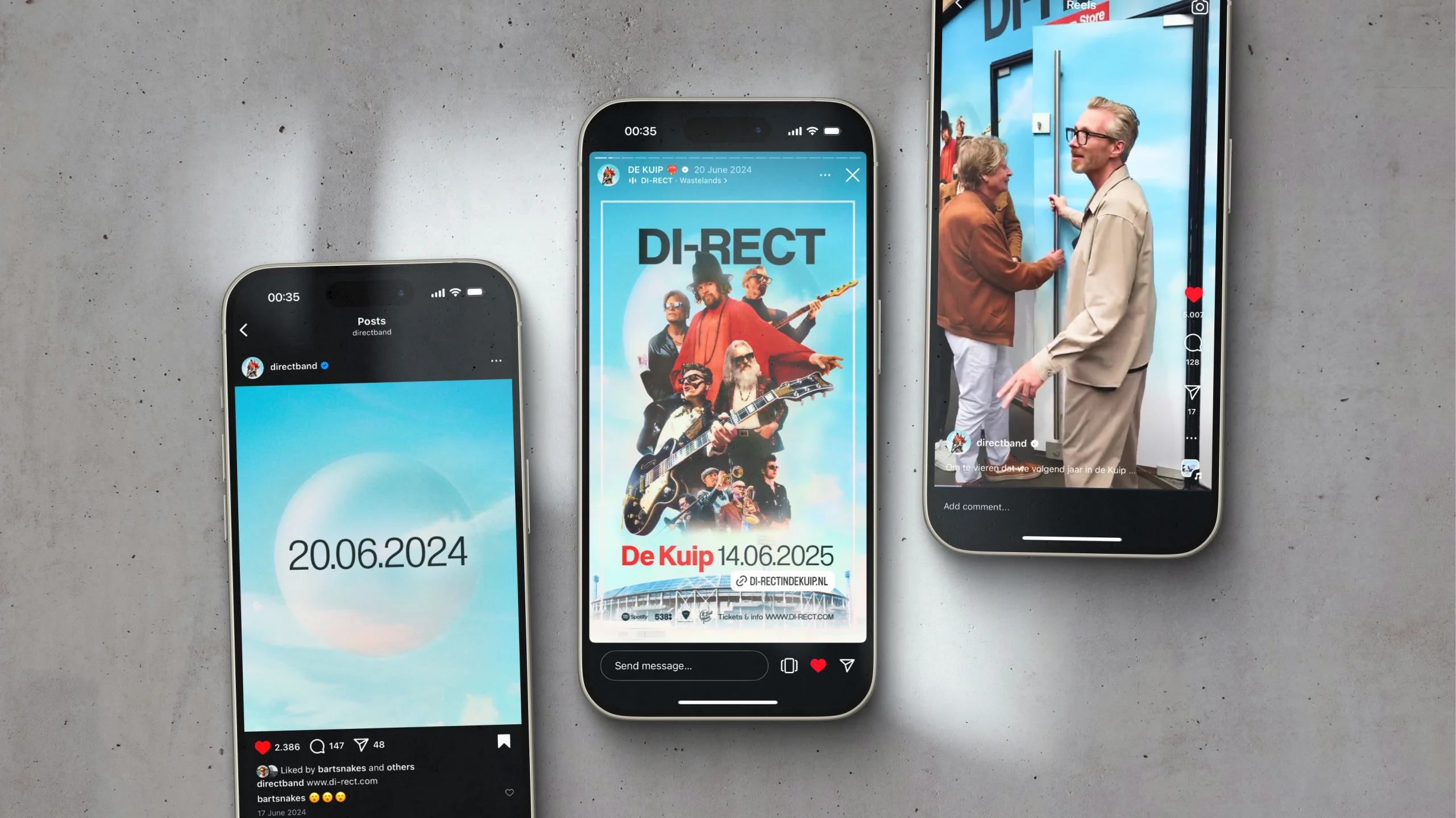
A job done
We hope every fan found their way to De Kuip. Because in the end, it’s all about the connection between the music and the audience.
Fun fact: while designing, we had DI-RECT blasting through the studio. This live album was our go-to soundtrack.