Overengineered anchor links

- Date
- 3 April 2025
- Tags
- FrontendUX
- Author
 Mats ErdkampDesign engineer
Anchor links are deceptively simple at first glance: click a button, scroll to the heading, and done. But if you ever had to implement them, you might have encountered the active anchor problem.
The issue is that headings toward the bottom of the page can be too far down to scroll into the desired position. In the visualization, the conclusion heading can never reach the trigger line. Surely this will be detrimental to the user experience. We need a solution.
Note that Conclusion can never become active.
Introduction
Velit est mollit ex do ex et aute consequat nisi enim incididunt aliqua quis. Velit esse incididunt pariatur deserunt amet mollit reprehenderit incididunt occaecat amet nulla excepteur amet deserunt. Aute sint adipisicing incididunt cupidatat. Ipsum id velit irure reprehenderit et. Laboris ad cupidatat aliqua labore dolore adipisicing consequat ullamco quis irure ipsum incididunt. Eu ad sunt quis minim exercitation. Aliqua cillum reprehenderit eu aute. Dolor reprehenderit minim fugiat ullamco duis irure.
The Problem
Eu incididunt consectetur incididunt eu amet ea. Occaecat ut aute non pariatur dolore ut irure sint consequat in deserunt quis ad labore. Consectetur nostrud eu sint sit proident ut ullamco cupidatat eiusmod exercitation nostrud et. Eu eu est dolor. Ad velit esse adipisicing proident velit ipsum laboris magna ad.
Middle Section
Cupidatat sit dolore sunt culpa culpa mollit reprehenderit mollit laborum velit aliquip qui tempor enim nostrud. Dolor enim do fugiat voluptate sint. Nisi velit est id et exercitation et consequat ea proident voluptate. Aliqua id sint nostrud deserunt exercitation nisi officia labore consectetur ea. Do fugiat cupidatat fugiat adipisicing. Esse aute pariatur culpa exercitation do. Magna eiusmod sit nisi.
Conclusion
Magna minim cillum consequat dolor id labore velit minim. Mollit do aute labore ullamco duis magna dolore amet velit aliqua reprehenderit nulla aute quis. Id duis irure est. Reprehenderit et labore cillum pariatur do consequat est duis.
Before we get into the options, let's create a more abstract visualization. Here, a viewport moves down the page, with the trigger line set at 25vh from the top of the viewport. This is what we will use to compare each approach.
Hotfix: extra padding
The simplest solution is to add extra padding. We calculate the height of that padding by taking the delta between the last heading and the lowest point the anchor trigger can reach.
Perfect, right? Well, sometimes the design team is not so fond of random extra padding, so let's keep searching.
Practical: shift the trigger line
Maybe instead of adding extra padding, we can shift the trigger line. This is also quite simple to do: calculate how far from the bottom the last heading is, and put the trigger line there as well.
The downside is that when a user clicks an anchor link, the heading could be placed all the way at the bottom of the viewport. Most people keep what they are reading in the top half of the screen. We need to keep looking.
Good: translate the trigger points
Instead of shifting the trigger line, we could translate the headings upward. Instead of using the actual heading locations as the trigger points, we create virtual headings and translate those upward. A virtual heading is not visible in the article; it is just the position we use to dictate the active state.
One might argue that this is pretty much the same as shifting the trigger line, and conceptually they would be right. However, thinking about trigger points gives us more mental flexibility, because it lets us apply different adjustments based on each heading's position.
The example visualizations now show the location of these virtual headings. The real heading stays in the same place in the article, while we visualize where its trigger point is.
In this example, one problem appears: the first heading is now too far up. The useful part of the virtual-heading approach is that individual trigger points can be adjusted with ease. But what is a good way to do that?
Great: translate trigger points fractionally
If we think about it, we do not need to translate all trigger points by the same amount. Only a few conditions need to be met:
- The headings need to be reachable.
- The headings need to stay in order.
We can meet these conditions by translating the trigger points fractionally. The first heading does not move, the last heading moves up by the full amount necessary to become reachable, and the other headings move up by a proportional amount based on their position between the first and last heading.
Now we are getting somewhere. This is a solid solution. You might want to stop here before your product manager starts giving you puzzled looks, wondering how fixing anchor links has suddenly turned into a three-week epic.
Awesome: create a custom mapping function
While the fractional solution works, it has flaws. We chose a trigger line that is 25% down from the top of the viewport. It would be nice to minimize deviation from this ideal line across all headings. The closer triggers happen to this semi-arbitrarily chosen line, the better the user experience should be.
Let's minimize the mean squared error of the delta between the headings' original positions and their virtual positions. We use MSE because it heavily penalizes large deviations, pushing the system toward a state where most virtual headings are close to their original spots, while still satisfying our reachability constraints. The constraint that headings must stay in order still applies.
This results in all reachable points staying at their original position. But now headings are bunched up at the bottom. That makes sense: minimizing mean squared error only cares about proximity to the original position; it has no force that opposes bunching. We need to define something that encourages virtual trigger points to maintain a certain distance from each other, ideally related to their original spacing.
Side quest: minimization functions
To explore this idea, we need to bust out Python. The core of the optimization is a loss function with two competing terms:
- Anchor penalty: how far a virtual heading is moved from its original location.
- Section penalty: how much the size of each virtual section differs from the original section size.
We combine these into a total loss:
The weights control the trade-off, with w_anchor + w_section = 1.
We define constraints to keep virtual headings inside the page boundaries, ensure the first heading does not float upward, and keep headings in order.
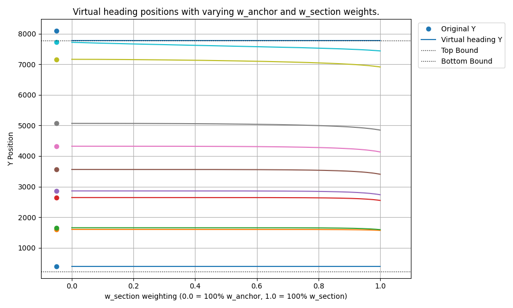
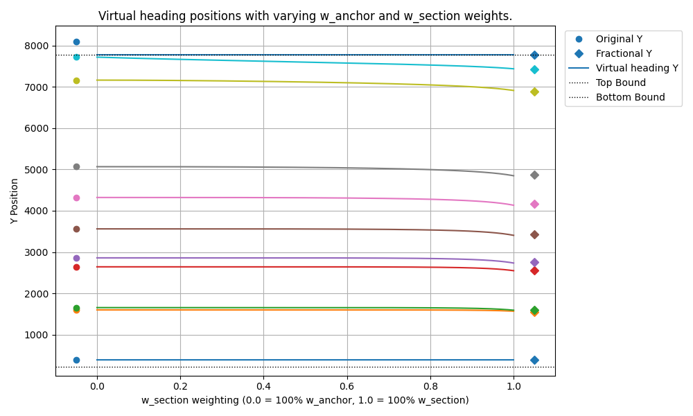
Running that optimization gives us a graph of how virtual heading locations change as the section penalty increases. The result is a useful sanity check: the fractional translation is exactly what the optimizer settles on when the section penalty is dominant.
Realizations
Staring at that optimization graph sparked a thought. First, the need to preserve section spacing really kicks in toward the end of the page, where headings get forcibly shoved upward to stay reachable. Second, let's consider the behavior of fractional translation on an edge case.
Imagine taking the entire Bible, from Genesis to Revelation, and rendering it as one continuous webpage. For the tech bros among us, you could alternatively imagine gluing all of Paul Graham's essays back-to-back. Now suppose the very last heading is just 200 pixels too low to hit the trigger line when scrolled to.
Does fractional translation make sense here? It means taking those 200 pixels of required uplift and spreading that adjustment across every single heading back to the start. With fractional translation, the error grows with the page length. If the page tends to infinity, so does the error. That would be sloppy, and users could notice it as feeling off.
The final version
This leads to the desired behavior for a smarter mapping function:
- For headings near the end of the page, apply more adjustment.
- For headings near the beginning of the page, apply less adjustment, or ideally none.
- The transition between these states should be smooth.
We need a function that maps a heading's normalized position x in [0, 1] to an adjustment factor y in [0, 1]. This factor determines how much of the maximum required uplift gets applied to the heading at position x.
The mapping function needs four properties:
- It must start at zero:
f(0) = 0. - It must end at one:
f(1) = 1. - The transition should start gently:
f'(0) = 0. - The transition should end gently:
f'(1) = 0.
It turns out that we can borrow a function from computer graphics: smoothstep. Smoothstep is a cubic polynomial that smoothly transitions from 0 to 1 over the range [0, 1].
But what if we do not want the transition to start right away? What if the adjustment factor should remain 0 until x reaches a certain point, say a, and then smoothly transition to 1 by the time x reaches 1?
We can preprocess x before feeding it into the smoothstep function:
Then we apply the smoothstep function to this clamped and scaled input:
This lets us use a to control the normalized position where the smooth upward adjustment begins. Setting a = 0 gives the original smoothstep over the whole range. Setting a = 0.5 means headings in the first half of the page do not move at all, while adjustment ramps up only in the second half.
Let's pick a = 0.4 and see what this adjusted smoothstep does.
It is beautiful.
Validation
So, we are finally done. We have gone to unnecessary depths to fix anchor links. A truly Carmack-esque feat that will be remembered for generations to come. Let's ask the lead designer what he thinks.

Want overengineered anchor links for your project? Get in touch.